The B2B Platform for Health & Insurance Operators
A one-year race to replace spreadsheets with a unified, reliable system that helped operators, insurers, and healthcare providers work faster, cleaner, and with less risk.

About the Project
From Multi-File Operations to a Centralized Platform
PIIX Panel is the internal B2B platform behind the PIIX mobile app, a product built to give underserved families in Mexico access to insurance and health services. When the company introduced an e-commerce module (members extending coverage, adding services, adding beneficiaries), operations became impossible to manage manually. PIIX Panel was born to bring everything together: people, policies, services, legal documents, and performance.
When operations scale, the product must adapt
Before PIIX Panel, every stakeholder worked out of Excel sheets, Google Drive folders, scattered forms, and manual WhatsApp communication.
This led to:
- Lost or duplicate information
- Slow membership approvals
- Legal and compliance risks
- Providers unable to upload service data efficiently
- Managers with zero visibility of performance
It wasn’t scalable, especially not for a healthcare product meant to support families or people with an emergency.
Users & Audience
We identified three key user groups during research:
Operators
Approve policies, validate member info, follow up cases, handle legal requirements.
Insurance & Healthcare Providers
Upload services, submit documentation, deliver care, manage tariffs, fill forms per case.
Managers & Admins
Monitor coverage performance, region usage, service quality, duplicated data, and operational load.
My Role
As the Senior Product Designer Consultant, I led the end-to-end design and expansion of the company’s B2B PIIX Panel, working entirely remote within a 11-person cross-functional team.
I worked alongside a Product Manager, Frontend and Backend Leads, a Data Scientist, Health and Insurance providers, and two mid level UX/UI designers (whom I helped mentor and expand).
The Panel Launched in Mexico on Jan 4th 2024 (I worked supporting non-US projects and LATAM clients.)
Scope & Constraints
- One-year deadline for version 1
- Building a high-risk, high-complexity system while also supporting the mobile app team
- No previous system existed → everything from IA to data logic had to be invented
- Providers had very different workflows, so standardization was delicate
- Operators needed automation, but full automation wasn’t technically possible
- Legal requirements dictated validation rules (IDs, contracts, forms)
We needed a hybrid solution:
Automation where possible, manual controls where needed.
Project Execution
How was all this work done
The iterative research, design, and coordination process.
This section outlines the key steps I followed to go from scattered spreadsheets and chaotic workflows to a unified operational platform.
I used a cycle of research → map → design → test → iterate, always pairing one challenge with one clear design response.
Each step reflects the real conditions we worked in: tight deadlines, high stakes, and constant collaboration across operators, insurers, and healthcare providers.
1. Research & Discovery
I conducted interviews with operators, insurance teams, and healthcare providers to understand how they approved policies, managed members, uploaded service information, and handled compliance.
What I found was messy but honest:
- Everything lived in Excel files, Google Drive folders, WhatsApp messages, and memory.
- No one had a complete picture.
- Duplicated information created legal risk.
- Providers couldn’t upload service data fast enough.
- Operators were manually validating IDs, forms, and documents one by one.
Shadowing their daily routines helped me see the emotional layer of their work:
stress, confusion, high stakes, and the fear of “missing something.”
I synthesized insights and mapped existing workflows to form the foundation of the new information architecture.
Iteration loop: Research → Workflow maps → Hypotheses → Prototype → Test → Adjust
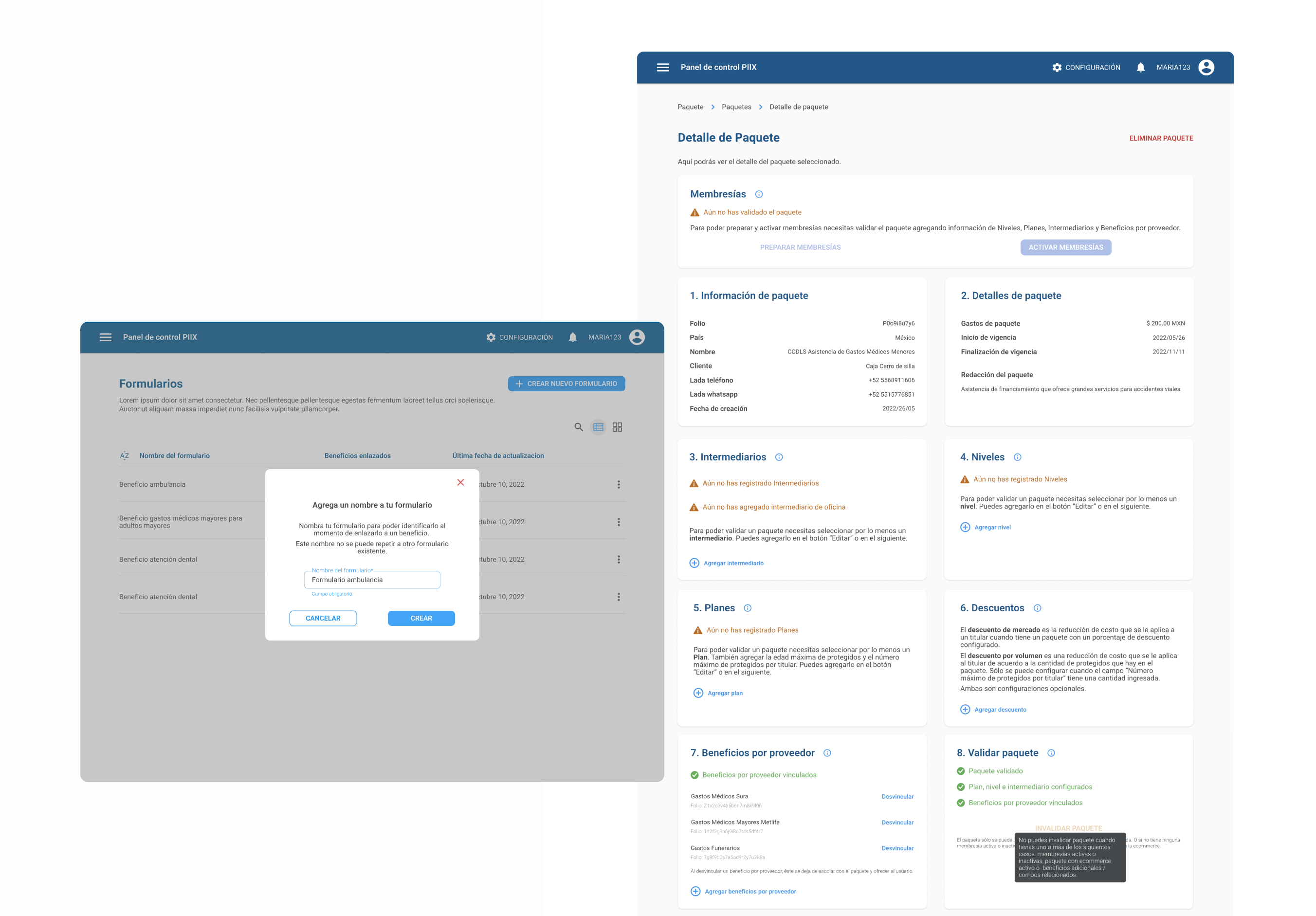
2. Information Architecture & Data Structure
PIIX Panel wasn’t just a UI problem it was a data problem.
We needed a way to unify policy holders, benefits, providers, forms, tariffs, and uploaded service records.
I collaborated with backend and frontend teams to create:
- A relational map that defined how every entity connected
- A role-based permission model
- A new site structure where operators, providers, and managers finally saw the same truth
This structure became the backbone of the entire product and later served as the basis for training materials and tutorials.
I also:
- Defined naming conventions and categorization for benefits, cobenefits, providers, and tariffs
- Created the first complete IA draft with PM to prioritize what needed to ship in year 1
3. Interaction Design & Prototyping
Every major feature went through full cycles of prototyping and testing with operators and providers.
Some of the most complex interactions included:
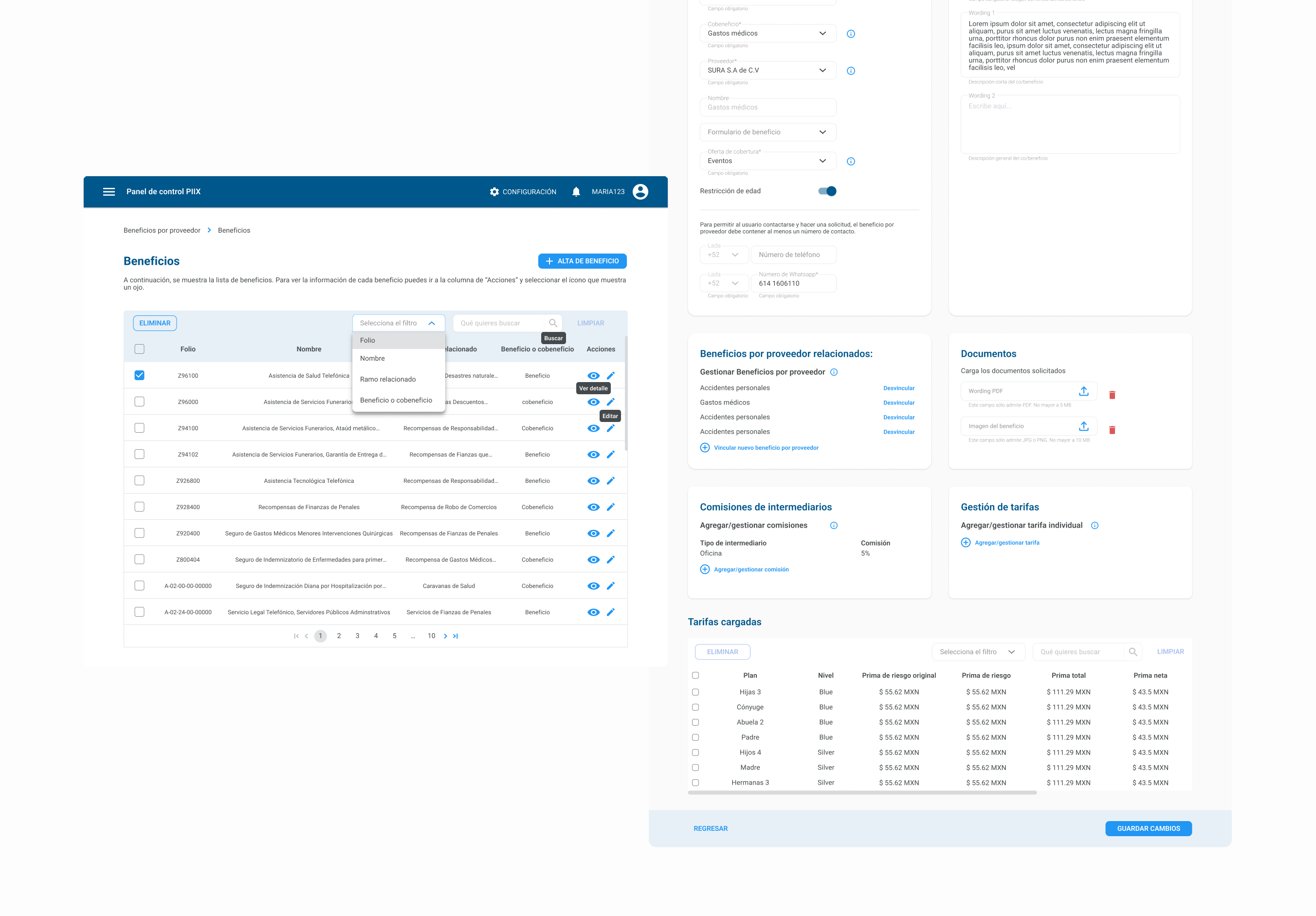
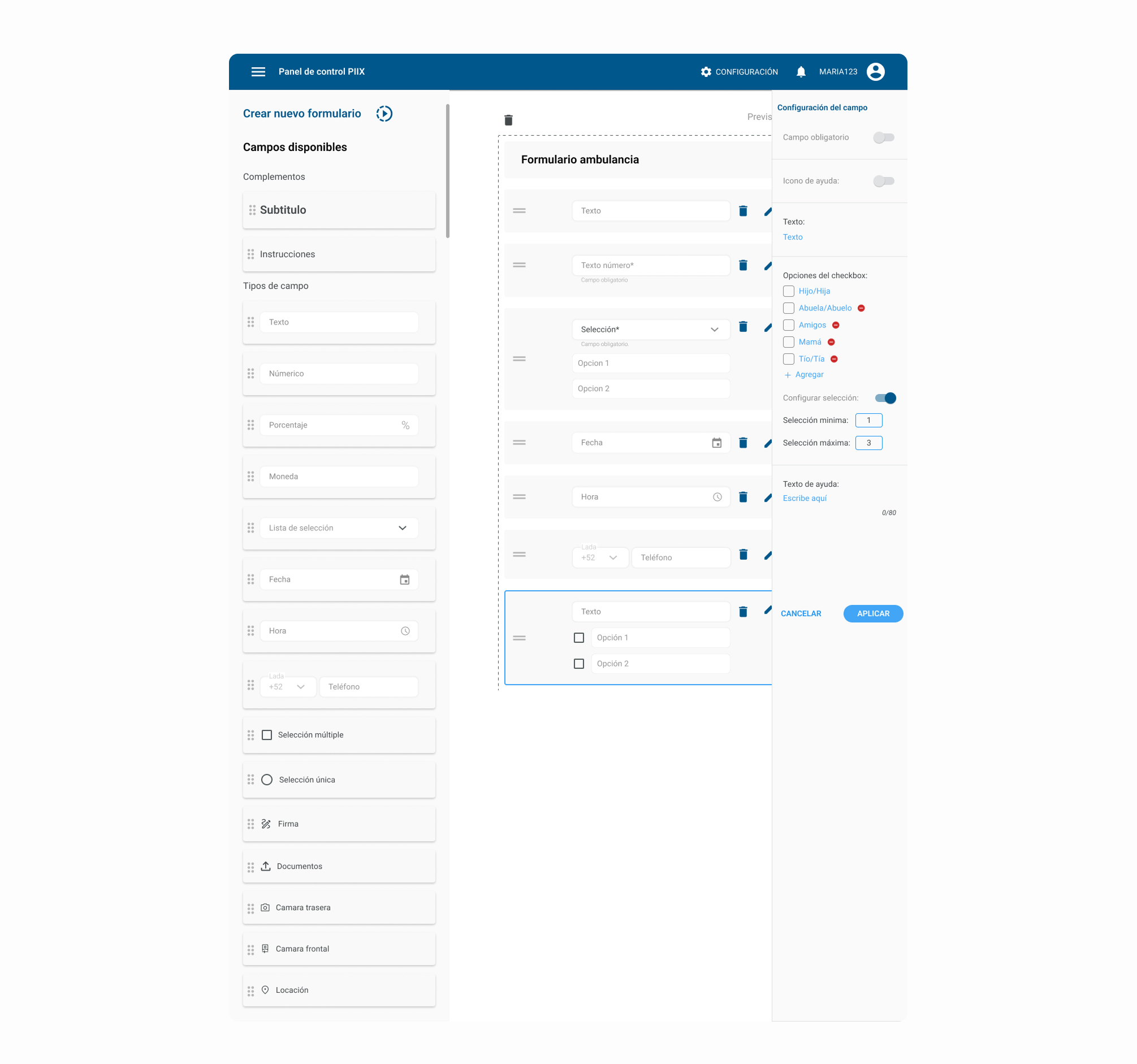
Designing the Forms Builder
Providers needed a way to collect the exact data required for giving medical or insurance services.
So I designed a dynamic form builder, letting them create forms with text fields, numeric inputs, multiple selection, phone & ID fields, date, hour, documents, photos, location, validation rules (min/max values, required fields)
This tool replaced dozens of inconsistent PDFs, WhatsApp forms, and Excel files.
How it worked:
- Drag-and-drop components
- Field-level configuration
- Reusable templates linked to benefits
- Server rules to prevent errors
Designing Operational Flows
I prototyped flows for member approvals, benefit and cobenefit management, tariff uploads (Excel ingestion), provider documentation, case follow-ups, e-commerce activation and deactivation
Each prototype exposed real constraints, so we iterated weekly to reduce friction and cognitive load.
4. Collaborating Across Disciplines
Because of the project’s complexity and timeline, clear and constant cross-functional collaboration was essential.
I worked daily with PM, backend, and frontend to:
- Align logic and workflows
- Reconcile technical limits with operational needs
- Keep the experience consistent across all modules
How: Co-creating requirement documents with PM, defining data relations with backend (and creating visuals and charts to help other designers and collaborator understand those relations), leding weekly design-dev syncs to validate feasibility, iterating flows after real operator feedback and documenting those
Result:
Less rework, clearer logic, and a shared understanding of “how the system should behave.”
5. Building a Design Culture
Beyond individual features, my goal was to leave the team with a sustainable design process.
How:
- Introduced Design Sprints to align teams around problem-solving.
- Established design documentation standards in Notion.
- Mentored new designers through peer reviews and weekly critiques.
- Promote documentation in Notion and color codes for each team in Zeplin.
Result:
A stronger design culture where research and iteration became part of the team’s DNA.
Outcomes & Impact
After one year, we launched PIIX Panel and it transformed operations:
- 60% reduction in manual tasks (approvals, validation, file handling)
- 80% faster provider uploads (Excel ingestion vs manual inputs)
- 35% fewer duplicated member records
- Faster service delivery and improved provider compliance
- Real-time visibility for managers
But the biggest outcome was cultural: Operators stopped drowning in files, Providers stopped asking for help to upload data and Managers finally saw what was happening.
The product became the operational heart of PIIX.
Final Reflections
This project reminded me that good systems don’t just organize data, they protect people. In insurance and healthcare, one missing field or slow approval can affect a family’s safety in an emergency. Designing PIIX Panel showed me that design isn’t just about clarity or beauty, it’s about time, and time can change outcomes.