PIIX Mobile App: Insurance Made Easy
End-to-End Redesign and E-commerce Expansion for a Leading Insurance Company that increased registrations by 75% and built trust with underserved users in Mexico.
About the Project
FROM IMPROVEMENT TO EXPANSION
An established insurance company in Mexico wanted to expand its reach and improve access to affordable protection plans for underserved populations.
As a Senior Product Designer I led the end-to-end UX and UI redesign of its mobile app (Android + iOS), in collaboration with PM and teams leads, to make the experience simpler, more trustworthy, and more inclusive.
DIGITAL INSURANCE PIONEER IN MEXICO
After one year of successful adoption, the company trusted our design team to extend the app with an e-commerce section, enabling users to: Add family members for protection, extend their existing coverage, and purchase complementary services for better care.
This evolution turned the app into a self-service protection hub, positioning the company as a pioneer in accessible digital insurance for everyday families.
Key outcomes
- +75 % increase in successful registrations
- Launch of new e-commerce experience after 12 months
- Reduced support calls and improved user retention
To comply with my non-disclosure agreement, I have omitted confidential information in this case study.
The Why Behind all this effort
The initial redesign aimed to remove barriers to entry and build trust with new users and increase the registration rate. Once the foundation proved successful, we faced a new challenge:
How might we extend the product’s value by allowing users to easily add family members, upgrade coverage, and manage multiple services, without overwhelming low-literacy users?
Users & Audience
We identified three key user groups during research:
- Primary Caregivers: often mothers or family heads responsible for others’ well-being (“madres cabeza de familia”).
- Goals: buy, renew, or manage family insurance.
- Pain points: unclear plans, difficult payment process, low tech confidence.
- Goals: buy, renew, or manage family insurance.
- Emergency Users – individuals in crisis moments (accidents, medical emergencies).
- Goals: request immediate assistance or locate coverage.
- Pain points: slow access to help, confusing SOS process.
- Goals: request immediate assistance or locate coverage.
- Older or Rural Users – people with limited digital experience.
- Goals: understand their policy and know they’re protected.
- Pain points: small fonts, complex language, few visual cues.
- Goals: understand their policy and know they’re protected.
My Role
As the Senior Product Designer consultant, I led the end-to-end redesign and expansion of the company’s B2C insurance app, working entirely remote within a 10-person cross-functional team.
I worked alongside a Product Manager, Frontend and Backend Leads, a Data Scientist, a Marketing Specialists, and two mid level UX/UI designers (whom I helped mentor and expand).
The App Launched in Mexico on Dec 4th 2022 (I worked supporting non-US projects and LATAM clients.)
Scope & Constraints
Balance regulatory compliance with user experience:
Every form, confirmation screen, and personal-data field had to meet insurance and privacy regulations, often requiring multiple consent steps.
Early usability tests showed that these extra steps created friction and led to registration drop-offs.
Time:
We had less than one year to design, validate, and deliver the full app, from research to launch.
The roadmap included the initial redesign, followed by the e-commerce expansion, which required additional coordination between design, engineering, and product.
Project Execution
HOW THE WORK HAPPENED
The iterative design and testing process.
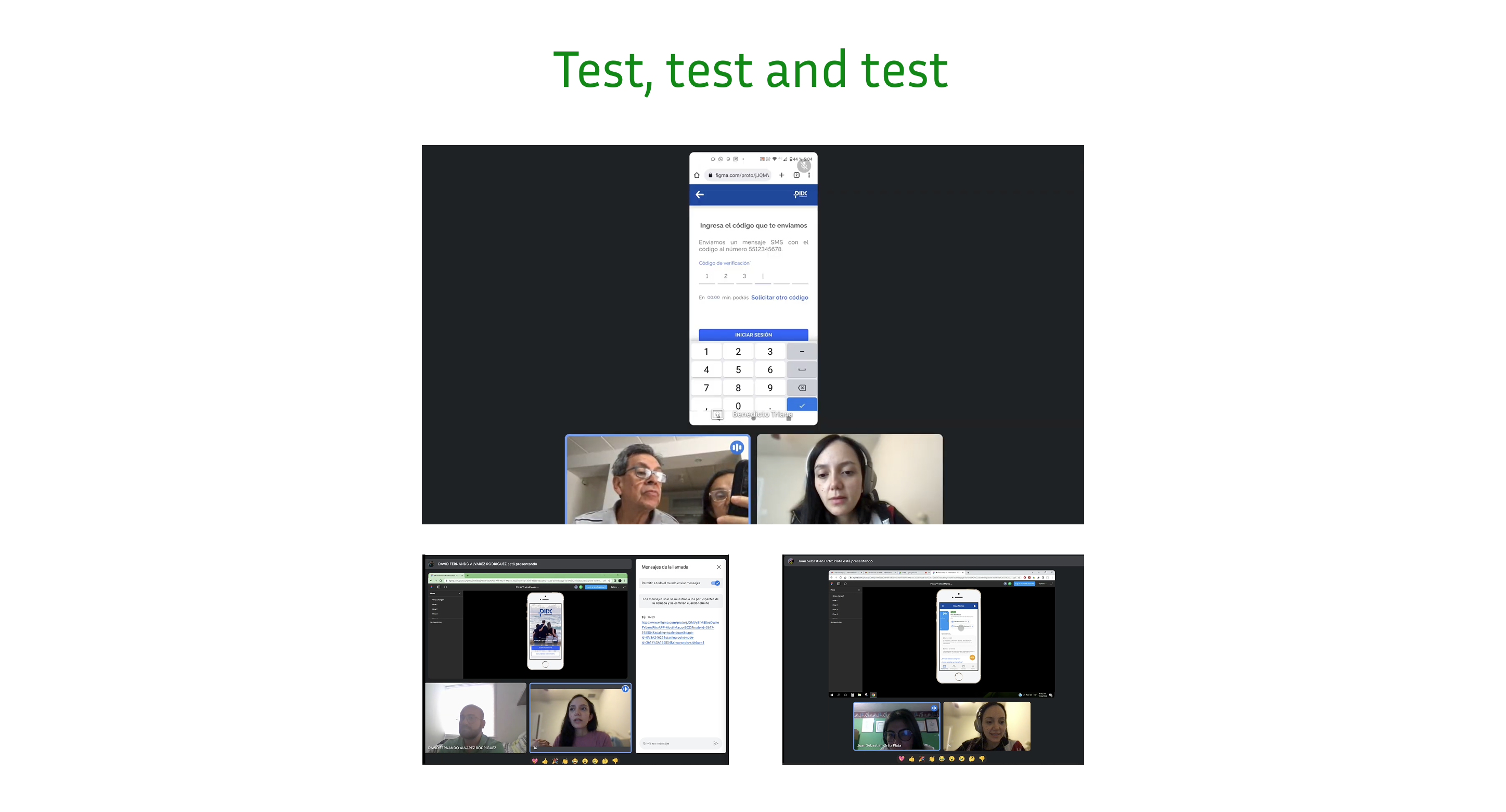
This section outlines the key steps I followed to go from discovery to launch , a cycle of research → prototype → test → iterate → validate → scale. Each story pairs one key challenge with my design response and the resulting impact.
1. Research & Discovery
- I conducted remote interviews (because covid) with users across Mexico, to understand pain points in registration, plan management, and emergencies.
- Then we discovered that most users struggled with long forms, unclear language, and slow loading screens, plus they don´t read.
- I enjoyed synthesizing insights into user flows and hypotheses, prioritizing clarity, trust, and performance.
Iteration loop: Research → Sketch → Prototype → Test → Iterate
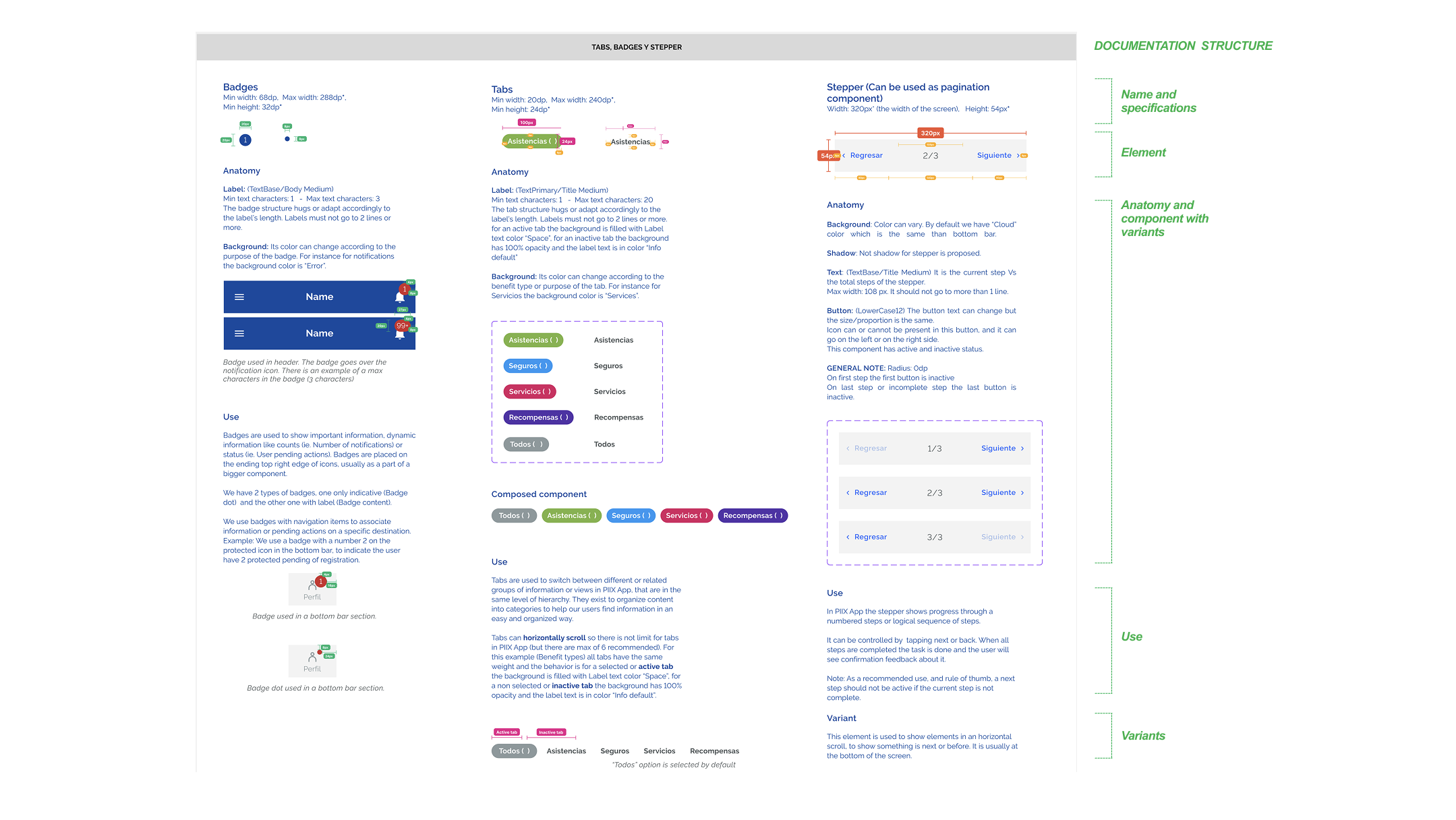
2. Information Architecture & Design System
- Created a unified design system in Figma, introducing design tokens and a consistent naming convention (componentType_state_platform) to align dev and design teams.
- Documented the full UI library, reducing design time for new features by 40%.
- Established design-review rituals to maintain consistency during the one-year remote development cycle.
3. Interaction Design & Prototyping
Each major feature went through multiple design and testing rounds to validate usability and performance:
Designing Safety: The Floating SOS Button
During research, users in rural areas shared that they often couldn’t find quick help in emergencies.
I proposed a persistent floating SOS button that stayed visible across all app screens. With one tap, users could call an ambulance or notify their emergency contact.
How:
- Designed accessibility-first (large touch target, color contrast, and persistent placement).
- Collaborated with backend to ensure low-latency trigger and with PM to define emergency workflows.
- Prototyped and tested via remote usability sessions.
Result:
Reduced emergency access time by nearly 60% and increased user trust and perceived security.
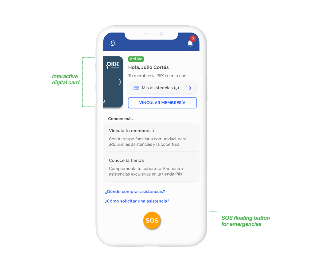
Designing the Digital Card Experience
Users complained about having to download PDF policies that were hard to access during emergencies.
I designed a digital card system that felt tactile and intuitive, like carrying a physical insurance card.
How:
- Prototyped an interactive swipeable card in Figma using component variants.
- Integrated QR and share functionality for quick verification.
- Collaborated with frontend lead to ensure local data storage for offline access.
Result:
Users could instantly view or share their insurance details, significantly increasing confidence and usability.
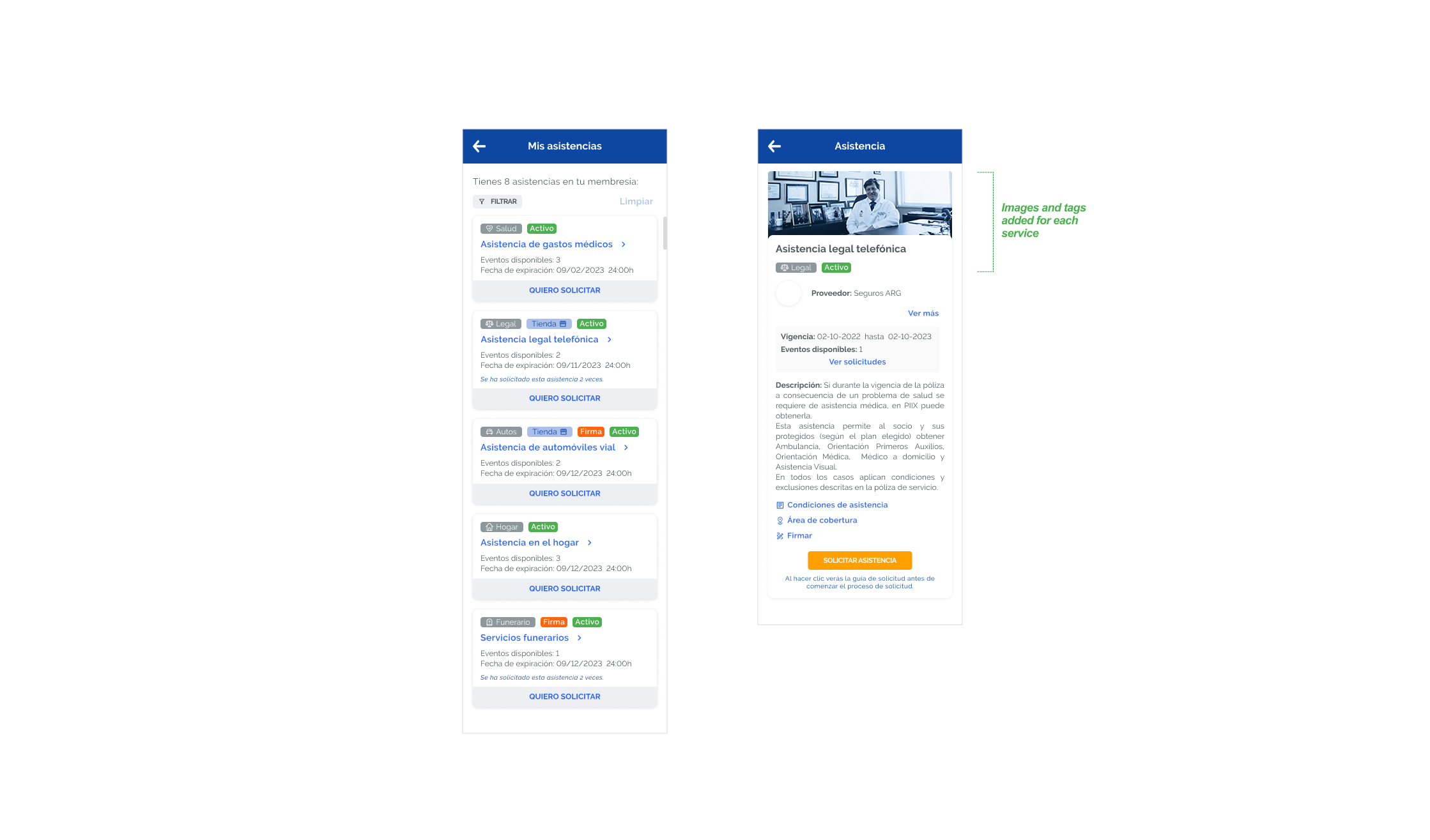
Improving Comprehension with Visual Services
Many users skimmed text or misunderstood the difference between insurance plans.
Through usability tests, we discovered that adding icons and imagery next to each service drastically improved understanding.
How:
- Conducted A/B testing with visual vs. text-only layouts.
- Partnered with PM to define service categories and visual hierarchy.
- Created a clean icon set and simplified service descriptions.
Result:
40% faster plan selection and fewer support queries related to “what’s included.”
Collaborating Across Disciplines
Given our fully remote setup, clear communication was essential.
I worked closely with the PM, frontend, and backend leads to align technical limitations and user needs.
How:
- Co-created feature requirement documents and analytics plans in Notion.
- Defined event-tracking points for user behavior (registrations, SOS activations, plan upgrades).
- Attended weekly design-dev syncs to review feasibility and QA details.
Result:
Reduced rework and improved implementation consistency by over 30%.
Skeleton Screens for Perceived Performance
To improve perceived performance on slower connections and long waiting time, I designed and implemented skeleton screens that visually previewed page structure while content loaded and the animated loaders. This subtle enhancement helped users feel the app was responsive, even under poor network conditions.
Result: Improved perceived speed and reduced drop-off during data fetches.
Supporting the App Launch
After a successful redesign and pilot test, we prepared for public release.
I joined the marketing and PM teams to create launch assets and copy for app stores.
How:
- Designed promotional visuals, banners, and in-app onboarding tips.
- Wrote concise, user-centered copy (“Protect what matters most, wherever you are”).
- Conducted QA on final build for visual and accessibility consistency.
Result:
Over 50K downloads within the first quarter post-launch, with strong user reviews emphasizing clarity and simplicity.
Building a Design Culture
Beyond individual features, my goal was to leave the team with a sustainable design process.
How:
- Introduced Design Sprints to align teams around problem-solving.
- Established design documentation standards in Notion.
- Mentored new designers through peer reviews and weekly critiques.
Result:
A stronger design culture where research and iteration became part of the team’s DNA.
Find below a quick example of one of our one-week design sprint i led, to explore, prototype, and validate solutions for beneficiary management and policy flows.
Quick note: I also managed Zeplin organization and created a color-coded comment system (🔵 Design / 🟢 Dev / 🟡 QA / 🔴 PM) to improve accountability and visibility among remote teams.
E-COMMERCE EXPANSION
After the success of the redesigned app, we launched a new e-commerce section that allowed users to:
- Extend their existing coverage,
- Add new beneficiaries, and
- Purchase additional protection services.
I led the UX design, flow mapping, and testing for this expansion:
- Designed a guided experience that reused the core registration logic for faster learning.
- Tested prototypes iteratively to ensure clarity and compliance with legal flows.
- Collaborated with backend and product teams to manage dynamic pricing and real-time eligibility.
Result: 25% increase in add-on purchases and stronger user retention through family coverage options.
SOLUTIONS AND KEY FEATURES
Together with PMs and stakeholders, we restructured the onboarding process and redesigned the user journey to prioritize simplicity and trust.
Key Features I Designed in collaboration with PM and backend and frontend leads:
- Two-phase registration flow: Separated essential account creation from sensitive document upload, improving conversion and user confidence.
- Family group management: Enabled users to add dependents and customize policies by age, needs, and health conditions.
- Emergency services shortcut: Simplified and highlighted access to emergency help directly from the home screen.
- Rebranded visual system: New color palette, typography, and iconography applied across all screens for visual consistency.
- Progressive onboarding: Step-by-step walkthrough of app features after first login.
Final Reflections
This project reinforced the importance of aligning user empathy with business needs — especially in complex, trust-driven industries like insurance. By breaking down friction in high-stakes flows and delivering flexibility for families, we created a product that truly served its members.
As a design lead, this was a powerful example of how listening to users, iterating quickly, and working closely with cross-functional teams can drive real business impact. Working remotely with such a diverse team taught me that strong documentation and empathy are the real bridges between disciplines.